Question: Children living near a smelter in Texas
Children living near a smelter in Texas were exposed to lead, and their IQ scores were subsequently measured. The following histogram was constructed from those IQ scores.
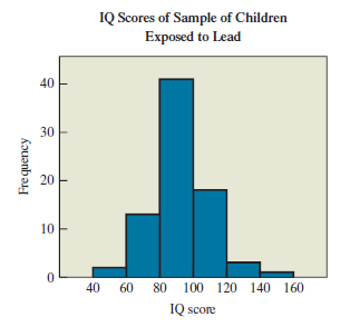
Figure 3.11
a. Estimate the frequency for each of the six score categories.
b. Estimate the total number of children included in the histogram.
c. What are the lowest and highest possible IQ scores included in the histogram?
d. How does the shape of the histogram change if relative frequencies are used instead of frequencies?
> What do we mean when we say that a distribution is skewed? Briefly describe the basic difference between a distribution that is skewed to the right and a distribution that is skewed to the left.
> What do we mean when we say that a distribution is symmetric? Can a symmetric distribution have more than one mode?
> Distinguish between a uniform distribution and a distribution with one or more modes. What do we call distributions with one, two, and three modes?
> You want to determine the mean weight of all professional (NFL) football players who were on team rosters during the past season.
> The ages of males when they were hospitalized because of myocardial infarctions (heart attacks)
> You are given a sample of data values along with specific bins. Your bar graph was marked wrong because it shows different frequencies than the ones shown on the teacher’s answer key.
> The net worth (in dollars) of female movie actors
> The ages of adults at the time of their death
> The ages of adults who visit the National Air and Space Museum
> The speeds of drivers on a highway in Montana
> The ages of 1000 randomly selected patients being treated for dementia.
> The weights of 240 adult airline passengers, consisting of 80 females and 160 males.
> The weights of 1000 AAA batteries of a single brand
> The heights of 500 female students, half of whom are college students while the other half are second-grade students
> The heights of 250 randomly selected female statistics students
> In a survey of California residents who text while driving, we obtained a simple random sample by compiling a list of the 24,390,236 licensed drivers in California; then we used a computer to randomly generate 1000 numbers between 1 and 24,390,236, and w
> The braking reaction times of 500 randomly selected drivers, measured under standard conditions.
> The annual incomes of all those in a statistics class, including the instructor
> The daily rainfall amounts (in inches) for Boston in a year consist of 365 values with these properties: • The mean daily rainfall amount is 0.083 inch. • The median of the daily rainfall amounts is 0 inches. • The minimum daily rainfall amount is 0 inch
> In a recent year, the 868 professional baseball players had salaries with the following characteristics: • The mean was $4,214,614. • The median was $1,650,000. • The salaries ranged from a low of $507,500 to a high of $31,000,000. a. Describe the shape
> The histogram in Figure 4.12 shows duration times of eruptions of the Old Faithful geyser in Yellowstone National Park.
> Figure 4.11 is a histogram of digits drawn in California’s Daily Four lottery.
> Figure 4.10 is a histogram of measured mid–upper arm circumferences of 300 randomly selected adults.
> The histogram in Figure 4.9 shows the F-scale measurements of intensities of 490 tornadoes from recent years. (The F-scale runs from 0 to 5; a higher number indicates a stronger tornado.)
> There’s much more variation in the ages of the general population than in the ages of students in my college extension course.
> The distribution of pedestrian speeds on a path used by both walkers and runners was found to be bimodal.
> Which type of graph described in this section would work best for depicting data consisting of one value from each of the past 50 consecutive years? What is a major advantage of this type of graph?
> A study on the effect of gender on movie attendance was biased because the sample consisted of 800 males and 200 females.
> The distribution of pedestrian speeds on a path used by both walkers and runners was found to be bimodal.
> The distribution of grades in my class was left-skewed, but the mean, median, and mode were all the same.
> A survey found that the mean salary for professional soccer players is much higher than the median salary.
> What is a weighted mean, and when is it appropriate to use one?
> Briefly describe at least two possible sources of confusion about the “average.”
> What are outliers? Describe the effects of outliers on the mean, median, and mode.
> Define and distinguish among mean, median, and mode.
> Imagine taking a huge flat map of the United States and placing weights on it to represent where people live. The point at which the map would balance is called the mean center of population. Figure 4.2 shows how the location of the mean center of popula
> Find the mean of the data summarized in the frequency table by using the middle of each bin and the frequency for each bin. Also, compare the computed means to these the actual means obtained using the original list of data values.
> Which types of graph described in this section can be used for qualitative data? Give an example of a qualitative data set, and describe how you would show it with each type of graph.
> Construct a Pareto chart of the data given in Exercise 19. Compare the Pareto chart to the pie chart. Which graph is more effective in showing the relative importance of the mistakes made by job applicants? Exercise 19 Chief financial officers of U.S. c
> Refer to the data given in Exercise 17, and construct a pie chart. Compare the pie chart to the Pareto chart. Can you determine which graph is more effective in showing the relative usefulness of the job–hunting methods?
> A medical researcher at Johns Hopkins University obtains a numbered list of all patients waiting for a heart transplant, and then uses a computer to select the patients corresponding to the 50 numbers randomly generated by computer.
> A survey was conducted to determine how employees found their jobs. The table below lists the successful methods identified by 400 randomly selected employees. The data are based on results from the National Center for Career Strategies. Construct a Pare
> Exercise 18 in Section 3.1 required the construction of a frequency table for a list of body temperatures (in °F) of randomly selected subjects. Use that frequency table to construct the corresponding histogram.
> Exercise 17 in Section 3.1 required the construction of a frequency table for the ages of Academy Award–winning male actors at the time when they won the award. Use that frequency table to construct the corresponding histogram.
> The percentage of flights on a single day by each airline (e.g., United, Delta, Southwest)
> IQ scores of 1000 adults randomly selected last year.
> The colors of cars involved in fatal crashes last year.
> The number of full-time students enrolled in colleges in each year since 1990.
> Suppose you have a list of blood platelet counts from 500 patients in a hospital. Which of the following is most helpful in understanding the distribution of those values: frequency table, pie chart, or histogram?
> I rearranged the bars on my histogram so that the tallest bar would come first.
> People magazine chooses its “best-dressed celebrities” by compiling responses from readers who mail in a survey printed in the magazine.
> A quality control engineer wants to draw attention to the car parts that require repair most often, so she uses a Pareto chart to illustrate the frequencies of repairs for the various car parts.
> Your pie chart must be wrong, because you have the 45% frequency wedge near the upper left and the answer key shows it near the lower right.
> What do we mean by cumulative frequency?
> What do we mean by relative frequency?
> What is a frequency table? How does it show categories and frequencies?
> The students in a statistics class conduct a transportation survey of students in their high school. Among other data, they record the age and mode of transportation between home and school for each student. The following table gives some of the data tha
> The traditional keyboard configuration is called a Qwerty keyboard because of the positioning of the letters QWERTY on the left in the top row of letters. Developed in 1872, the Qwerty configuration supposedly forced people to type slower so that the ear
> Consider the following frequency table for the number of children in American families. a. According to the data, how many families are there in America? b. How many families have two or fewer children? c. What percentage of American families have no chi
> An experiment was conducted in which a hole was drilled in a die and filled in with lead. The die was then rolled repeatedly, giving the results shown in the following frequency table. a. How many times was the die rolled? b. How many times was the outco
> The following data show the body temperatures (in °F) of randomly selected subjects who were not ill at the time. Construct a frequency table with seven bins: 96.9–97.2, 97.3–97.6, 97.7–98.0, and so on. 98.6 98.6 98.0 98.0 99.0 98.4 98.4 98.4 98.4 98.6 9
> Motivated by a student’s death due to binge drinking, the College of Newport conducts a study of student drinking by randomly selecting 10 different classes and interviewing all of the students in each of those classes.
> The following data show the ages of all Academy Award–winning male actors at the time when they won the award (through 2016). Construct a frequency table for the data, using bins of 20–29, 30–39, and so on. What ages are the most common for these winners
> Weights of respondents were recorded as part of the California Health Interview Survey. The last digits of weights from 50 randomly selected respondents are listed below. Construct a frequency table with 10 classes. Based on the distribution, do the weig
> An analysis of 50 train derailment incidents identified the main causes listed below, where T denotes bad track, E denotes faulty equipment, H denotes human error, and O denotes other causes (based on data from the Federal Railroad Administration). Const
> As part of a clinical trial, the drug tofacitinib citrate was administered in 5-mg doses to 1336 subjects as a rheumatoid arthritis treatment. Here are the numbers of adverse reactions: 57 subjects had headaches, 21 had hypertension, 60 had upper respira
> Births at a hospital in New York State occurred on the different days of the week (in the order Monday through Sunday) with these frequencies: 52, 66, 72, 57, 57, 43, 53. Construct a frequency table with a column for relative frequencies given as percent
> What are the lowest and highest possible pulse rates that could be included in the frequency table?
> List the cumulative frequencies that correspond to the given frequencies.
> List the relative frequencies that correspond to the given frequencies.
> How many females are represented in the frequency table? How many categories are in the frequency table?
> I saw two frequency tables of airline passenger weights, one using bins that spanned 10-pound ranges (e.g., 101 to 110 pounds) and the second with bins that spanned 20-pound ranges (e.g., 101 to 120 pounds). The first table had twice as many categories a
> A market researcher surveys 50 randomly selected drivers from each state and obtains the amount that they paid for a gallon of gas at their most recent purchase.
> A poll conducted two months before a presidential election predicted that the Republican candidate would win with 55% of the vote; the survey had a margin of error of 3 percentage points. The Republican candidate lost the election.
> The third category in my frequency table has a cumulative frequency of 150.
> The third category in my frequency table has a relative frequency of 25%.
> I made a frequency table with two columns, one labeled State and one labeled State capital.
> What is the purpose of binning? Give an example for which binning is useful.
> If the CPI increases, must wages also increase? Explain.
> In making price comparisons, why is it important to adjust prices for the effects of inflation? Briefly describe how we use the CPI to adjust prices.
> What is the Consumer Price Index (CPI)? How is it supposed to be related to inflation?
> What is an index number? Briefly describe how index numbers are calculated and what they mean.
> If a house is valued at $835,000 in Dallas, find the price of a comparable house in Denver.
> If a house is valued at $835,000 in Denver, find the price of a comparable house in Dallas.
> Because the batteries used in heart pacemakers are so critically important, you want to determine the average (mean) length of time that such batteries last before failure.
> If a house is valued at $375,000 in San Francisco, find the price of a comparable house in Las Vegas.
> If a house is valued at $375,000 in Las Vegas, find the price of a comparable house in San Francisco.
> If a house is valued at $650,000 in Boston, find the price of a comparable house in Phoenix.
> If a house is valued at $400,000 in Denver, find the price of a comparable house in Miami.
> If a house is valued at $940,000 in Los Angeles, find the price of a comparable house in Chicago.
> If a house is valued at $940,000 in Chicago, find the price of a comparable house in Los Angeles.
> Using the CPI values from the above table and Table 2.2, determine what the subway fare should have cost in 1990 if it cost $2.75 in 2015 and prices had risen with the CPI. What does this tell you about how actual subway fares changed compared to the CPI
> Using the CPI values from the above table and Table 2.2, determine what the subway fare should have cost in 2006 if it cost $2.50 in 2013 and prices had risen with the CPI. What does this tell you about how actual subway fares changed compared to the CPI
> Using the CPI values from the above table and Table 2.2, determine what a slice of pizza should have cost in 2014 if it cost $1.35 in 1995 and prices had risen with the CPI. What does this tell you about how actual pizza prices changed compared to the CP
> Using the CPI values from the above table and Table 2.2, determine what a slice of pizza should have cost in 2010 if it cost $1.00 in 1986 and prices had risen with the CPI. What does this tell you about how actual pizza prices changed compared to the CP
> Recognizing that overloading commercial aircraft would lead to unsafe flights, you want to determine the average (mean) weight of airline passengers.
> If you spent $3.19 for a pound of coffee in 2006, what would the price have been in 2012?
> If you spent $5.62 for a pound of coffee in 2012, what would the price have been in 2007?
> If you spent $2.90 for a pound of coffee in 2005, what would the price have been in 2015?
> If you spent $4.75 for a pound of coffee in 2015, what would the price have been in 2010?